In this blog post graphic methods are used to describe tourism time series in Bosnia and Herzegovina.
Two types of a line graph could be used to show changes in tourist demand over time. The first displays all three time series (total, domestic and foreign tourists) on a single graph. This graph shows the relative position of time series to each other. However, if the time series levels are disproportional in size then on this graph is difficult to spot patterns in time series.
The second graph displays each series on a separate panel. On such graph any persistent pattern related to trend or seasonal factors should be clearly visible. Figure 1 shows line graphs of tourists arrival and overnight stay in Bosnia and Herzegovina.

From Figure 1 is quite clear that the foreign tourists made a major contribution to total tourists arrival and overnight stay, particularly from 2013. While both total and foreign tourists arrival series show quite similar seasonal patterns, this pattern is not clear for the domestic tourists arrival series because the level of this series is much lower than the levels of the remaining two series on this graph.
Figure 2 shows each tourism time series in Bosnia and Herzegovina on separate panels.
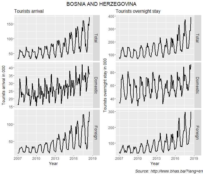
On the graphs in Figure 2 the differences in seasonal patterns between domestic and foreign tourists arrival and overnight stay are prominent. Now it is clear that the domestic tourists arrivals series has quite distinctive seasonal pattern than the other two series. These differences will be further examine on the seasonal plots. Also there is a rapidly increasing trend in all series after 2013. This is not clearly visible on the graphs because the seasonal component dominates the time series. But, when the trend component is extracted then this feature of the trend will be more clearly visible.