
Ljubljana’s Okun whisper: When growth and jobs almost agree – Part I
The methodology behind this exercise, why we test stationarity, cointegration, dynamics and causality in that order, was explained in a separate blog post. Here we start where policymakers (and most readers) start anyway: with the pictures, and what they suggest before the data are put on a formal econometric witness stand.
1. Slovenia is the “clean” case, so why doesn’t the story write itself?
If you wanted to pick a former socialist economy where Okun’s Law might behave like a respectable macro regularity, Slovenia would look like the obvious candidate. The report itself frames it that way: a transition economy that became a modern market economy, joined the European Union and the Eurozone, and lived through multiple episodes, transition, global crisis, euro-area stress, pandemic, while building institutions that, on paper, should make economic relationships more legible.
And yet the report’s opening warning is quietly subversive: it does not assume that growth “drives” unemployment in one direction, or that a single linear relationship should hold over three and a half decades. It explicitly raises the possibility of changing slopes, asymmetries, and structural breaks, because Slovenia’s economy and labour market did not merely experience shocks; they evolved. In other words, the “clean case” is still a moving target.
That is why Part I matters. Before any tests, the charts can show whether the relationship looks stable across episodes, whether the labour market adjusts like a spring or like a sponge, and whether the direction of the story is as simple as political speeches imply.
2. Two Okuns, two policy instincts
The report uses two complementary ways to tell the Okun story, and each speaks to a different policy instinct.
The first-difference specification relates annual GDP growth (the change in log GDP per capita) to annual changes in the unemployment rate. This is the headline-friendly approach: growth up, unemployment change down. It is also the approach most likely to be noisy, because it compresses a complicated adjustment process into year-to-year co-movements.
The gap specification shifts the frame from “growth this year” to “slack this year.” It asks whether output is above or below its potential (an output gap) and whether unemployment is above or below its “natural” level (an unemployment gap). The gap view is more policy-like: it aligns with stabilisation talk, economies running hot or cold, and with the logic that what matters for unemployment is not raw growth but deviations from sustainable capacity.
Crucially, the report does not treat the gap construction as a philosophical claim. It uses the Hodrick–Prescott filter as a practical tool to extract trend and cycle, acknowledging the usual criticisms (such as end-point bias and sensitivity to the smoothing parameter), but choosing consistency and interpretability for a small annual sample. The goal is not to win a filtering debate; it is to get an operational measure of slack that can be compared to labour-market slack.
3. What the level lines say: the law shows up in the crises first
The most straightforward visual test of Okun’s intuition is not a regression at all. It is simply this: when GDP takes a hit, does unemployment visibly rise, and does it do so quickly?
As shown in Figure 1 the report’s level plot (log real GDP per capita and the unemployment rate) offers a clear first impression. GDP trends upward over the sample, but the trend is not monotonic: the global financial crisis around 2009 produces a sharp contraction, and the COVID-19 shock around 2020 produces another interruption. Unemployment, meanwhile, is more cyclical, rising in contractions and falling in expansions, exactly what a reader expects from a “growth–jobs link.”
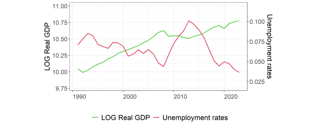
But the report does not let the reader stop at “opposite directions, job done.” It emphasises asymmetry: unemployment tends to rise faster in recessions than it declines in recoveries. That is not a trivial detail. It suggests that in Slovenia, the labour market may behave more like an escalator going down than up, fast in downturns, slow in upturns, which is the kind of dynamic that turns temporary shocks into prolonged social costs. The report explicitly floats interpretations such as labour-market rigidities or hysteresis effects as a plausible reading of that asymmetry.
For a policy audience, the immediate implication is simple: “growth returning” is not the same as “labour market healing.” If unemployment is sticky on the way down, then recovery policy is about persistence, not just rebound.
4. The first-difference lines: The right sign, but plenty of noise
As shown in Figure 2 the first-difference plot takes the same variables and turns them into their year-to-year changes: GDP growth and changes in unemployment.
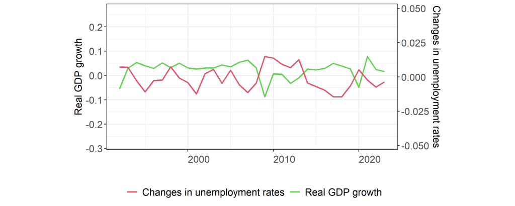
Here the drama becomes clearer, and messier. GDP growth swings widely, with large negative shocks in 2009 and 2020 standing out. Those years also coincide with spikes in unemployment changes, aligning with the basic Okun intuition. In “normal” years, however, the relationship looks looser: high growth often coincides with falling unemployment, but not reliably; there are episodes where growth occurs with unemployment still rising or barely improving. The report reads this as suggestive of jobless growth or lagged labour-market adjustment.
That matters because it helps separate two kinds of policy disappointment. One is the crisis disappointment, growth collapses and unemployment jumps. That is the classic Okun story, and the chart supports it. The other is the recovery disappointment, growth resumes, but unemployment does not fall as quickly as hoped. The chart hints that Slovenia has experienced episodes of the second kind too, which is where debates about matching, participation, and structural change tend to begin.
5. Slack, made visible: The gap plots and the policy narrative they invite
If the first-difference view is the “yearly news cycle” of Okun’s Law, the gap view is the “policy cycle.”
As shown in Figure 3 the report constructs the output gap by comparing GDP to its HP-filtered potential output, and then reads negative gaps as underperformance and positive gaps as above-trend periods. What makes this useful is not the exact numeric value; it is the ability to narrate the business cycle with a consistent yardstick across decades.
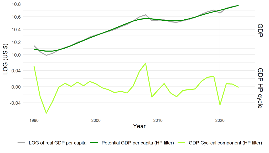
In this framing, crises become episodes of pronounced negative output gaps. Recoveries become periods where the gap closes. The report then pairs this with a labour-market analogue, as shown in Figure 4: the unemployment gap, defined as actual unemployment minus an HP-filtered natural rate (NAIRU). In a tidy Okun world, negative output gaps should coincide with positive unemployment gaps.
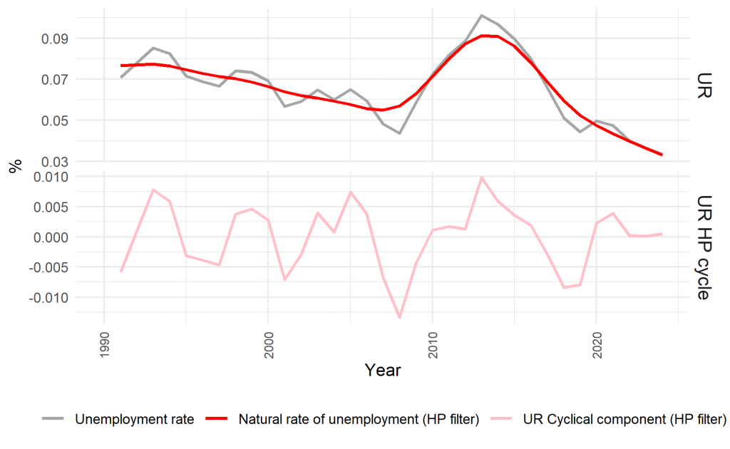
The report’s reading is that the unemployment gap does indeed spike during crisis periods, reinforcing the idea of cyclical labour slack. But it also claims something more economically interesting: the unemployment gap is more asymmetric than the output gap, with deeper and more prolonged positive deviations. That is another way of saying what the level plot already hinted: the labour market appears to absorb shocks quickly but “forget” them slowly. Even after output returns toward potential, unemployment slack can remain elevated, an interpretation consistent with hysteresis-style dynamics, long-term unemployment, mismatch, or limited mobility.
From a policy perspective, the gap view encourages a stabilisation logic: if output falls below potential, support demand to close the gap and reduce unemployment slack. But the asymmetry the report emphasises also points to a complementary logic: even when you close the output gap, labour-market healing may require targeted measures to speed re-employment and reduce persistence.
6. Scatterplots: Where Okun either becomes a line, or refuses to
The scatterplots are the bridge between “these lines look related” and “there is a relationship we can estimate.” They also reveal whether the relationship is stable across regimes or dominated by outliers.
The report includes scatterplots for both the first-difference model and the gap model, with the dependent-variable framing stated explicitly.
Under your selection rule, we include only the gap-model scatter figure as the visual anchor (Figure 5), but we still comment on both. The first-difference scatter (not shown here as a placeholder) is described as widely dispersed with a weak linear trend, with 2009 and 2020 appearing as outliers, suggesting potential nonlinearity or structural breaks. That description matters because it tells the reader what simple regressions are fighting against: a handful of extreme years that contain much of the macro signal.
Now the gap model.
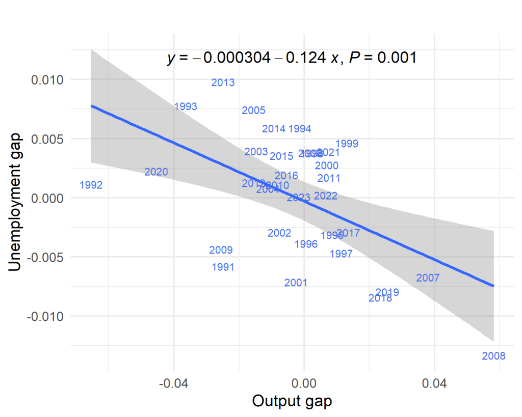
The report’s interpretation is that the gap scatter is “tighter” and offers stronger empirical support for Okun’s Law than the first-difference scatter. In the gap framing where the output gap predicts the unemployment gap, the negative linear pattern is described as clearer; the Okun coefficient is reported as larger and statistically significant; and the direction of influence is portrayed as more convincing from output deviations to labour-market slack than the other way around.
This matters economically because it lines up with the logic of slack: unemployment is not responding to “growth” in the abstract; it is responding to whether the economy is operating above or below capacity. That is a more coherent stabilisation narrative, and the report’s visual evidence suggests Slovenia fits it better than it fits the noisier year-to-year growth story.
But the report also refuses to declare victory. Even in the gap model, the outliers remain, 2009 and 2020 still sit far from the regression line, implying that the relationship may not be constant over time. That is the key takeaway for a reader who wants to use Okun as a policy rule: the gap view improves the signal, but it does not eliminate regime dependence.
7. What Part I can conclude, and what it must not
At the end of the graphical stage, the report leaves us with a balanced message.
What it can conclude, in plain English, is that Slovenia’s data broadly align with the intuition of Okun’s Law. Output and unemployment often move in opposite directions around major shocks. The labour market looks cyclical and responsive to downturns. And the gap specification, by focusing on slack rather than raw growth, appears to produce a cleaner visual relationship, with a more interpretable direction from output deviations to unemployment slack.
What it cannot conclude, at least not honestly from pictures alone, is that Slovenia has a single, stable Okun coefficient that holds across the transition period, the global financial crisis, euro-area stress, and the pandemic, as though the economy were the same machine throughout. The report repeatedly flags the possibility of structural shifts and nonlinearity. The charts suggest asymmetry. The scatterplots suggest outliers that could dominate simple regression estimates. And the sample is annual, meaning every data point is doing a lot of work.
So the right posture at this stage is neither triumph nor cynicism. It is curiosity disciplined by caution.
8. Bridge to Part II: When the data have to pass formal tests
Part II takes the relationship from “looks plausible” to “is statistically defensible.” That means starting with the unglamorous questions: are these series stationary or drifting; do they contain breaks; do GDP and unemployment share a long-run relationship; do dynamic models tell a coherent story about adjustment; and finally, does one variable predict the other in a causality sense. The charts in Part I suggest that Slovenia may offer stronger support for Okun’s Law than many other transition economies, especially in the slack-based (gap) framing. The risk is that this apparent clarity is partly the product of the same few dramatic episodes. Part II will test exactly that: whether the relationship survives when we stop admiring the line and start interrogating the data.