Zagreb’s Okun riddle: When growth returns but jobs don’t always follow – Part I
The charts hint at a relationship, then quietly argue about timing and strength.
The methodology behind this exercise, why we test stationarity, cointegration, dynamics and causality in that order, was explained in a separate blog post. Here we begin as most readers (and many policymakers) do: with the pictures, and with what Croatia’s data appear to say before the formal testing begins.
1. Croatia is not just testing Okun’s Law; it’s testing Okun’s patience
Okun’s Law is often treated as macroeconomics’ polite social contract: if output grows faster, unemployment should eventually fall; if output collapses, unemployment should rise. The report begins by reminding us why this “law” is useful precisely because it is not literal. It is an empirical regularity, first articulated in the early 1960s by Arthur Okun, whose strength depends on institutions, shocks, and the mechanics of labour-market adjustment. Croatia, with its quarter-century of structural change, is therefore not a routine test case; it is the kind of case that reveals whether the relationship is a stable channel or a fair-weather friend.
The report situates Croatia as a small open economy that has undergone major transformation over the past quarter-century and that experienced a sequence of events capable of bending macro relationships: the early-2000s recovery, the global financial crisis of 2008–2009, a prolonged recession and gradual recovery, EU accession in 2013, the COVID-19 pandemic shock in 2020, and a post-pandemic rebound. It also notes euro adoption in 2023 and points to EU structural funds as part of the post-pandemic recovery context. That is not decorative background. It is a warning label: when the underlying economy shifts, the slope of Okun’s relationship can shift with it. “Beyond simple linear regression” is not a stylistic preference here; it is a necessity the report flags early.
Two specifications anchor the story. The first-difference model links annual GDP growth (or changes in output) to annual changes in unemployment, useful for short-run responsiveness. The gap model links cyclical slack to cyclical slack: the unemployment gap (actual unemployment minus its natural rate) to the output gap (actual output minus potential). The report explicitly uses the Hodrick–Prescott filter to estimate these unobserved trend components. It does not dwell on the metaphysics of “potential” or “natural”; it treats them as practical devices for making the relationship more policy-relevant.
Before the econometrics begin, the report insists on a simple discipline: look at the data. Not because pictures prove anything, but because they reveal timing, outliers, and likely breakpoints, clues that determine whether later models should include dummy variables, whether the relationship might be asymmetric, and whether a single slope is likely to be a convenient fiction.
2. The small-sample problem: Croatia’s annual data are informative, and unforgiving
The report’s data constraints are not footnotes; they are part of the interpretation. Croatia’s annual GDP per capita and unemployment series run from 2000 to 2024, giving only 25 observations. The report is explicit: this is a small sample for establishing robust time-series relationships, and the power of later tests depends on sample size, so results should be interpreted cautiously. That statement belongs in Part I because it changes how the reader should view the figures.
With such a short sample, each dramatic year can dominate visual relationships. A single crisis, 2009, 2020, even the post-COVID rebound year, can tilt a scatterplot and pull a regression line. The report returns to this idea repeatedly in its graphical analysis: extreme events are not just “interesting points”; they are influential observations that can distort the underlying relationship unless they are handled explicitly.
This is why the graphical section does three things in sequence. First, it shows levels to make the macro history visible. Second, it shows first differences to isolate year-to-year co-movement. Third, it shows gaps to convert the story into a slack narrative. Finally, it tests the relationship visually through scatterplots and then checks whether the slope appears stable over time via piecewise regression. The narrative logic is coherent: from history, to fluctuations, to slack, to a relationship, to whether the relationship itself changes.
3. Levels: The big shocks write the first draft of the story
The level plot is where the report lets Croatia’s economic history speak in a single frame: log real GDP per capita alongside the unemployment rate.
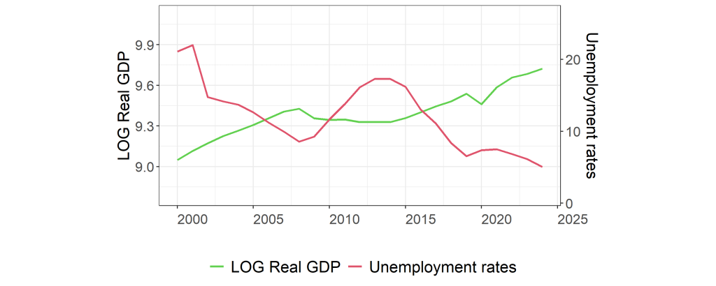
As shown in Figure 1 the report highlights two major events that dominate the level dynamics: the global financial crisis of 2008 and the COVID-19 outbreak in 2020. Both produce substantial declines in real GDP per capita in their respective years. But the recovery dynamics differ sharply. After 2008, the report notes that it took roughly five to six years before real GDP per capita began to recover and show consistent growth. After the COVID shock, the decline is described as sharp but short-lived, followed by a relatively swift and steady rebound.
This alone is a useful Okun lesson. A “GDP shock” is not one thing. The labour market’s adjustment depends on whether the shock is prolonged or brief, whether uncertainty persists, and whether the recovery is slow grind or fast snap-back. The report’s implication is clear without being overstated: Croatia’s macro context includes episodes where the output side behaved very differently across crises, so one should not expect unemployment to respond in identical ways.
In levels, the unemployment rate’s behaviour can be read as the labour-market mirror of those episodes. But the report does not rely on a simplistic mirror metaphor. Instead it uses the level plot to flag what later models must confront: long recession phases, structural change, and the possibility that the labour market’s “baseline” itself shifts over time.
4. First differences: The inverse movement is visible, especially when things go wrong
The first-difference plot translates the level story into annual changes: GDP growth (in log terms) and changes in the unemployment rate.
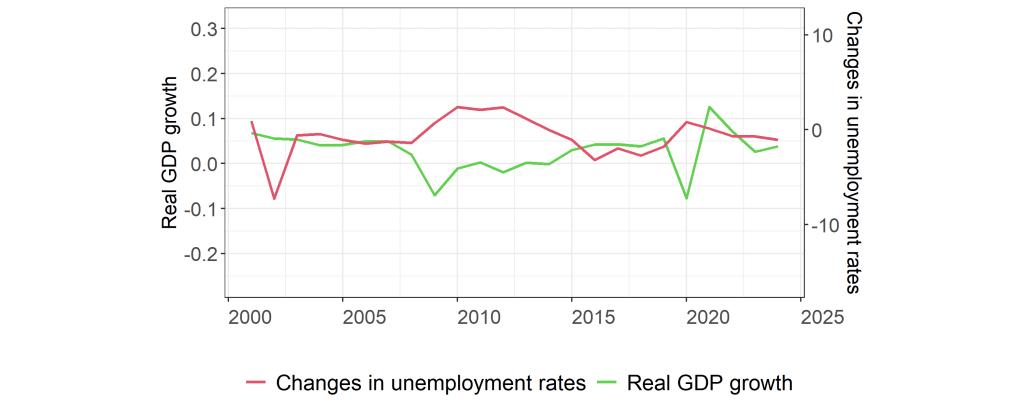
The report reads Figure 2 as more stationary and mean-reverting than Figure 3.1, which supports the practical appeal of working in first differences for a dynamic Okun relationship. The inverse movement of growth and unemployment changes is particularly apparent from 2008 to 2016. The report then calls out the years that matter: 2009 and 2020 show sharp movements and are interpreted as economic shocks, with strong GDP contractions coinciding with notable increases in unemployment. These years also appear as outliers, meaning they carry disproportionate influence in any regression or scatter.
This is where the report begins to make a methodological point through an economic lens. It suggests that the extreme events may require dummy variables or robust estimation, not because econometrics demands them, but because economics does: a crisis year is not “a larger normal year.” Treating it as such can distort the relationship you are trying to measure.
The report also notes the importance of lagged adjustment. Even if output recovers quickly, the unemployment change series may not reverse immediately. That is the seed of a later policy interpretation: cyclical recovery does not automatically translate into labour-market recovery in the same calendar year.
5. Slack and the policy narrative: Gaps turn the story from “growth” to “imbalance”
The report’s gap model is explicitly built for policy interpretation. Instead of linking growth to unemployment changes, it links cyclical deviations of output to cyclical deviations of unemployment. To do that, it estimates potential output using the HP filter and defines the output gap as actual minus potential. It similarly applies the HP filter to unemployment to estimate a natural rate and defines the unemployment gap as actual unemployment minus that natural rate.
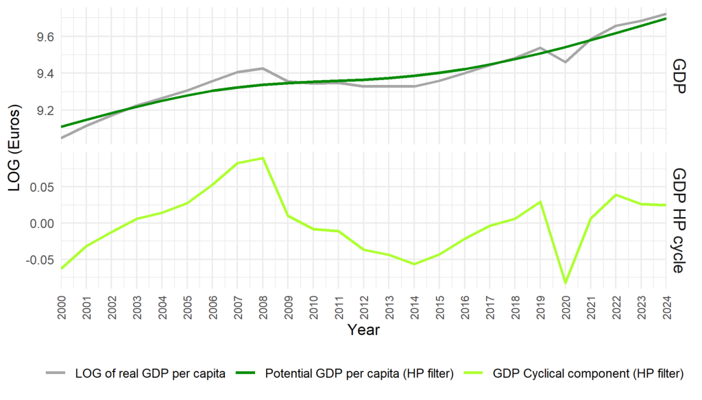
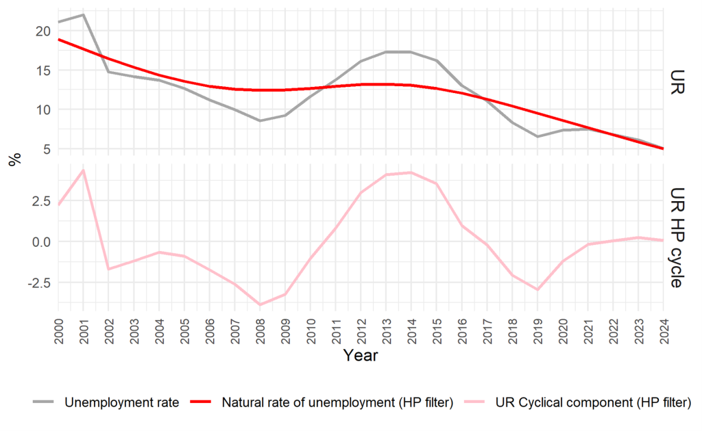
The report explains the unemployment gap plainly: it is the cyclical component of the unemployment series, defined here as the difference between actual unemployment and the trend component of the HP filter. The economic point is to isolate labour-market slack from longer-term shifts.
Once you view the world in gaps, the Okun intuition becomes sharper. Negative output gaps correspond to periods when the economy runs below its estimated capacity; positive unemployment gaps correspond to periods when unemployment runs above its estimated natural rate. In a stable Okun relationship, those two should move together in the expected directions: when output is below potential, unemployment should be above its “natural” baseline.
The report does not linger on how gaps are constructed. It uses the HP filter as a practical tool and treats the gap framework as a way to express Okun’s coefficient in a policy-relevant language: a mapping from cyclical demand weakness (or slack) to labour-market imbalance.
The subtle twist is that gap thinking also makes it easier to discuss persistence. If an output gap closes but an unemployment gap remains positive, then the labour market is lagging the macro recovery, or structural frictions are preventing slack from dissipating quickly. The graphical section sets up that possibility as a plausible reading of Croatia’s experience across prolonged recession and uneven recovery phases.
6. Scatterplots: The relationship is there, but the outliers argue loudly
The report then moves from co-movement in time to co-movement in pairs: scatterplots that visualise the relationship between output measures and unemployment measures.
Under your selection rule, when both difference-model and gap-model scatterplots cover the same core topic, we include only the gap-model figure as the visual anchor and comment on both in prose.
The report describes the first-difference scatterplots (not shown here as a placeholder) as negative in slope, consistent with Okun’s Law, but with substantial dispersion. It explicitly identifies outliers associated with the global financial crisis and the COVID period. It notes that in 2009 and 2020 Croatia experienced drops in GDP growth with small changes in unemployment, while 2021 shows a large GDP growth rate with a small change in unemployment. The economic reading is intuitive: the labour market does not respond one-for-one to growth in every year; adjustment can be lagged, buffered, or distorted by unusual conditions.
Now the gap model, which the report treats as cleaner.
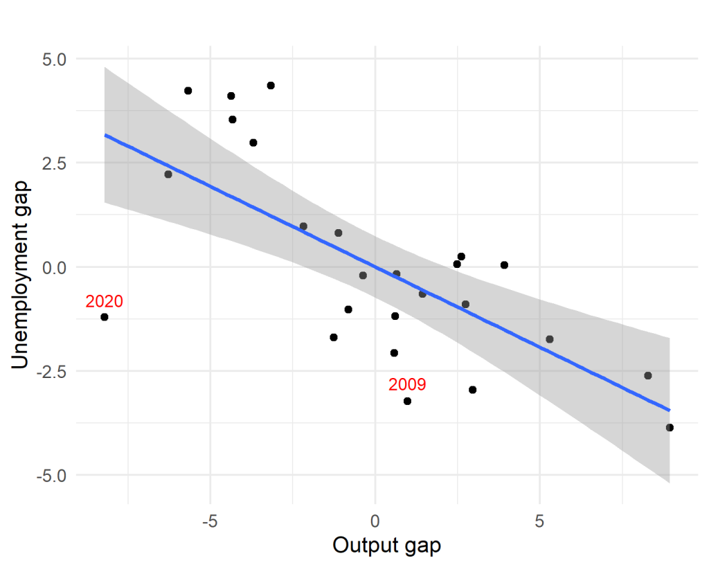
The report’s narrative suggests a stronger and more linear negative relationship in the gap formulation. It notes that the points are more tightly clustered around a downward-sloping line, reinforcing the idea that cyclical slack in output aligns with cyclical slack in unemployment. But it still flags influential observations from crisis periods, especially the COVID year, as points that can affect the slope materially and may require dummy variables or robust techniques later.
This is the key lesson Part I wants the reader to take forward. Okun’s relationship can be visible and still unstable. The gap model improves the signal by stripping out trend, but it does not eliminate the dominance of a few extraordinary years in a short sample. The relationship looks “linear enough” to estimate, but it may not be constant enough to trust blindly.
7. Piecewise regression: Croatia’s Okun slope is not a single slope
The report does not stop at “scatter looks negative.” It asks a harder question: is the relationship stable over time?
That is where piecewise regression comes in. Rather than assume one slope fits the whole 2000–2024 window, it allows different segments to have different slopes. This is especially relevant in Croatia’s context because the period includes a long post-2008 recession and then later recovery phases, followed by the pandemic shock. If the economy’s structure and labour-market behaviour changed across those phases, averaging them into one coefficient could be misleading.
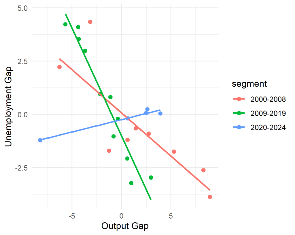
The report’s interpretation is explicit: the relationship between the output gap and the unemployment gap is not stable over time. It describes earlier segments showing consistent negative association and later segments showing reduced sensitivity or an altered slope. It emphasises that these patterns strengthen the case for models that account for structural breaks and unusual events, and it suggests that piecewise or regime-switching frameworks can be more appropriate when estimating Okun’s Law over long and turbulent periods.
Economically, this is not a technical aside. It is a policy warning. If the Okun slope changes across regimes, then “how much growth is needed to reduce unemployment” is not a timeless constant. It depends on the phase of the cycle, the aftermath of crises, and possibly deeper structural changes in the labour market.
8. Why simple regression might be inadequate: A warning that belongs before the tests
The report then steps back and explains, in plain macro terms, why simple regression can mislead. Okun’s Law is a relationship between growth and unemployment, but modelling it correctly depends on properties of the underlying series. If variables are not stationary, correlations can appear simply because both are moving over time rather than because one responds to the other. And if the relationship changes across time, because of structural breaks, regime shifts, or unusual events, then a single linear estimate may compress incompatible episodes into a single number that fits none of them well.
This “why inadequate” section is strategically placed. It belongs in Part I because it forces readers to treat the figures as diagnostic tools rather than as verdicts. It also prepares the reader for the full econometric sequence to come: unit root testing, cointegration methods, dynamic models, and causality analysis. The report’s message is not that the simple regression is useless. It is that without checking the foundations, stationarity, breaks, and long-run structure, you cannot know whether the slope you estimate is meaningful or merely convenient.
9. What Part I can conclude, and what it must not
So what do Croatia’s visuals allow you to say, before any formal testing?
They allow you to say that the basic Okun intuition is visible. During major negative shocks, GDP growth collapses and unemployment dynamics shift in the expected direction. The post-2008 episode appears prolonged, with recovery taking years; the COVID shock appears sharp and short-lived. In the gap framing, the relationship between output slack and unemployment slack looks tighter and more linear than the year-to-year growth relationship, suggesting that the gap model may provide a more policy-relevant way to summarise the connection.
They also force you to say what you cannot responsibly say yet. You cannot claim a single stable Okun coefficient for Croatia over 2000–2024, because the piecewise evidence suggests instability. You cannot assume crisis years are “just bigger” observations, because the scatterplots flag them as influential outliers that can distort slopes in a small sample. And you cannot treat a simple regression line as proof of a causal mechanism, because timing, lags, and structural change remain open questions.
Part I therefore ends where good empirical work should: with a disciplined sense of what the data are hinting at, and with a clear list of why hints are not enough.
10. Bridge to Part II: Where the proofs begin
Part II begins exactly where Part I stops: with the report’s formal testing sequence. The question becomes not “does the line slope down?” but “what kind of series are these, do they share a long-run relationship, how do dynamics and asymmetries behave, and does output help predict unemployment in a causality sense?” The visuals suggest the gap model may be Croatia’s cleanest Okun narrative, but they also suggest that breaks and shock years matter enough to change the story. In short: the charts in Zagreb whisper “Okun is there.” Part II will test whether the whisper survives cross-examination.