
Zagreb’s Okun riddle: When growth returns but jobs don’t always follow – Part I
The charts hint at a relationship, then quietly argue about timing and strength.
The methodology behind this exercise, why we test stationarity, breaks, cointegration, dynamics and causality in that order, was explained in a separate blog post. This Croatia quarterly series comes in three parts: Part I reads the pictures, Part II walks through the formal results, and Part III pulls the threads together for policy.
1. Why Croatia’s quarterly Okun story is sharper, and more treacherous
Okun’s Law is the sort of “law” that behaves like a polite dinner guest: generally dependable, occasionally awkward, and prone to changing its tone depending on who else is at the table. The report frames it in the classic way, an inverse relationship between economic activity and unemployment, then immediately adds the necessary caveat: this is an empirical regularity, not a physical constant. Croatia’s last quarter-century is therefore not a tidy laboratory. It is a live economy that has moved through distinct phases, early-2000s expansion, the global financial crisis and a long post-crisis slump, EU accession, a later recovery, and the COVID shock, each of which can bend the growth, jobs link in its own way.
Quarterly data makes the story more vivid. Annual data can smooth over timing and hide the awkward lags that matter for policy. Quarterly data, by contrast, insists that we watch the labour market in something closer to real time. That is useful, and it is also dangerous. Useful because it allows the analyst to see whether unemployment responds quickly or slowly, symmetrically or asymmetrically, and whether big shocks behave like “more of the same” or like regime changes. Dangerous because quarter-by-quarter relationships can look noisy, and in short samples even a handful of extraordinary quarters can dominate the slope of any fitted line.
The report’s strategy in this first part is deliberately humble: before the tests and models, it conducts a structured “look first” exercise. It seasonally adjusts the series (because seasonal artefacts are not the business cycle), plots levels and differences (because long-run drift and short-run movement are different animals), constructs output and unemployment gaps (because slack is a policy language), and then uses scatterplots and a piecewise regression visual to see whether a single linear Okun relationship is plausible over the whole period.
2. Two Okuns in plain English: Changes and gaps
The report organises the analysis around two common specifications of Okun’s Law.
The first is the first-difference model, linking GDP growth to changes in unemployment. In quarterly terms, it reads like a newsroom headline: “growth weakens, unemployment rises.” It is appealing because it feels close to policy conversations and because it focuses on changes rather than levels. But it can also be volatile: quarter-to-quarter noise, lagged adjustment, and crisis outliers can make the relationship look less stable than it is.
The second is the gap model, linking an output gap (how far output is from estimated potential) to an unemployment gap (how far unemployment is from an estimated natural rate). This is the stabilisation-policy view: slack in output should map into slack in the labour market. The report constructs those gaps using the Hodrick–Prescott filter. It keeps the discussion practical: potential output and the natural unemployment rate are not directly observed, but they can be approximated by decomposing the series into trend and cycle. The gap framing often produces a cleaner narrative because it removes long-run drift and focuses attention on cyclical deviations, exactly what most discussions of “overheating” and “slack” are trying to capture.
A key advantage of presenting both is that each answers a slightly different economic question. The difference model asks: when growth shifts, how does unemployment change? The gap model asks: when the economy runs below (or above) capacity, how much labour-market slack appears? One is about short-run movement; the other is about cyclical imbalance. Croatia’s experience, especially across large shocks, makes the contrast worth taking seriously rather than treating as a technical footnote.
3. First, make the data fit for purpose: Seasonal adjustment as economic hygiene
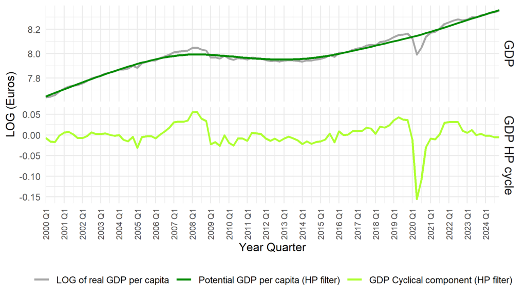
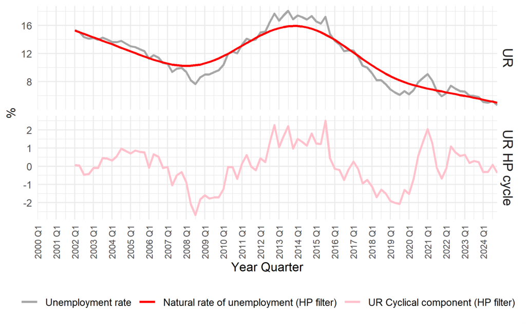
Quarterly macro data often contains seasonal patterns that have nothing to do with the cycle policymakers care about. The report is explicit: if you want to interpret the growth–unemployment relationship, you should remove predictable seasonal swings that can distort co-movement and produce spurious patterns. As shown in Figures 1 and 2 it applies the X-13ARIMA-SEATS procedure and retains only the seasonally adjusted series for the remainder of the analysis.
That is not merely statistical tidying. It is an interpretive choice. In policy terms, seasonal adjustment is a way of saying: we are interested in demand, capacity, and labour-market slack, not in the calendar.
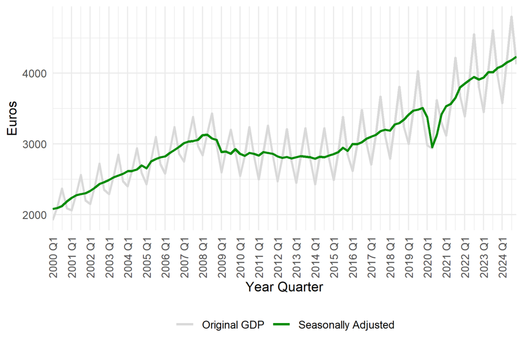
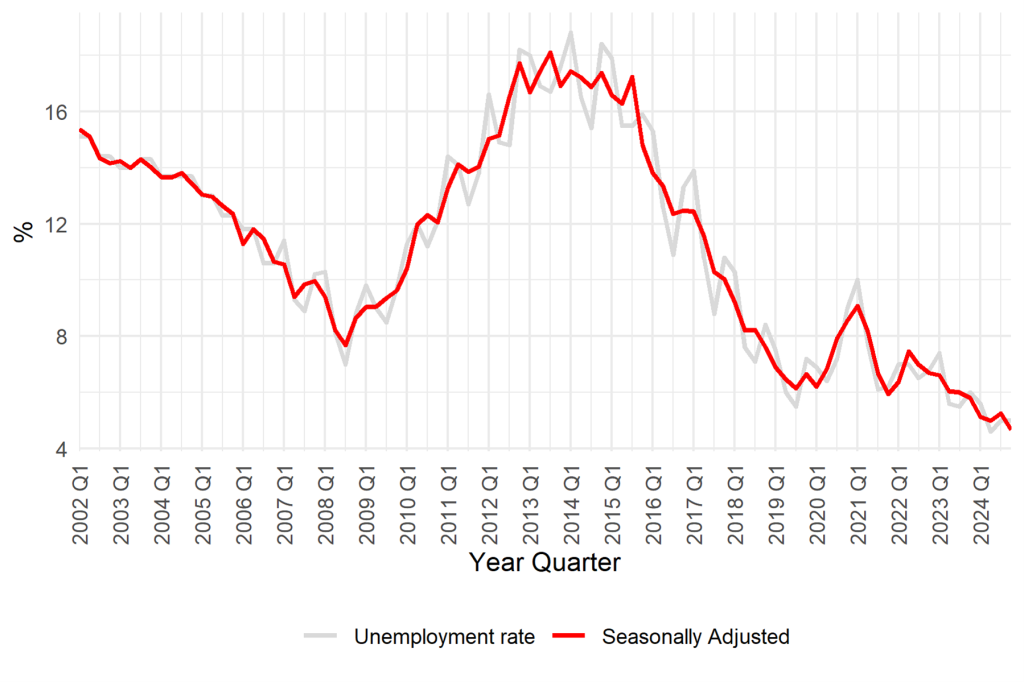
The report’s discussion of the adjusted series previews the central narrative arc. On the GDP side, it describes long-term growth interrupted by two major recessions: a gradual contraction around 2008–2009 and a steeper, shorter contraction in 2020. On the unemployment side, it notes higher volatility and greater persistence: the financial crisis produces a prolonged elevation in unemployment that lasts into the early 2010s, while the pandemic shock produces an intense but more temporary rise. That contrast, GDP bouncing back faster than unemployment, already hints at an Okun relationship with lags and asymmetry, not a neat one-quarter mechanical link.
4. What the level plot shows: The inverse pattern, and the tyranny of big events
As shown in Figure 3 the report then places the two key series side by side in levels (with GDP per capita in logs) to give the reader the broad macro storyline.
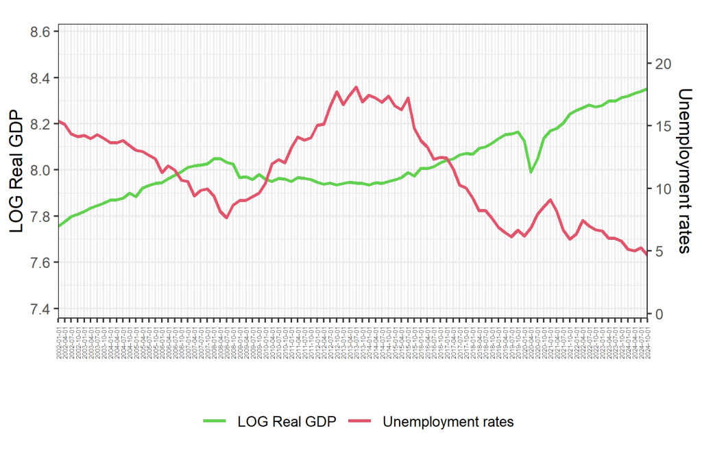
The visual message is the familiar Okun one: periods of rising output align with falling unemployment and vice versa. But the report does not stop at the “strong inverse pattern” line and move on. It singles out the two defining disruptions of the sample: the global financial crisis and the COVID-19 pandemic. Both coincide with substantial drops in GDP per capita, but the recoveries differ, and so does the labour-market response.
The report emphasises that after the 2008 crisis the recovery is slow, measured in years rather than quarters, and that unemployment remains elevated for a prolonged period. The pandemic, by contrast, is described as a sudden drop followed by a relatively quick resumption of growth, though with a sharp labour-market impact in the initial shock quarters. In plain economic terms, Croatia’s data contain at least two types of downturn: a long grinding one that can scar labour markets, and a short sharp one that can produce dramatic spikes.
This matters for the Okun relationship because the “law” is not just a slope; it is a mechanism. In a prolonged slump, firms may restructure, labour-force participation may shift, matching may deteriorate, and hysteresis-like dynamics can appear, so unemployment can remain high even when output begins to recover. In a short sharp shock, the initial unemployment response can be intense, but the recovery may also be faster if the shock is temporary and policy buffers are effective. The level plot cannot prove those mechanisms, but it does force the analyst to treat the sample as heterogeneous rather than homogeneous.
5. Short-run movement: When quarterly changes sharpen the link, and expose the outliers
As shown in Figure 4 to get closer to the short-run Okun intuition, the report plots first differences: quarterly changes in log GDP per capita and quarterly changes in the unemployment rate.
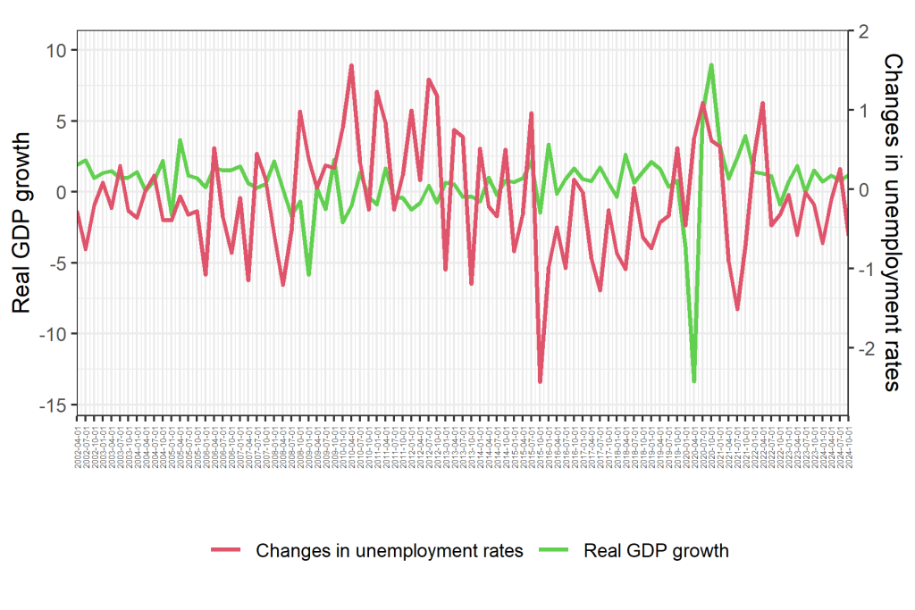
This figure is where the quarterly data earns its keep. The report notes large negative GDP shocks, particularly in 2009 and 2020, paired with sharp increases in unemployment. In other words, the Okun pattern is not only visible in levels; it appears in the timing of shocks too.
But the report also highlights what is arguably more important for interpretation: outside crisis periods, movements are smaller and more stable, suggesting that the “everyday” Croatian business cycle looks different from the “headline” crisis cycle. That is an essential clue for later modelling, but it already has a policy implication in Part I: the labour market’s sensitivity to output shocks is not uniform across states of the world. When the economy is hit by rare, extreme events, the relationship can look steep and dramatic; in ordinary times, it can look milder and more difficult to pin down.
The first-difference plot also hints at lagged adjustment. Even when output begins to improve, unemployment changes may not immediately reverse; job creation can follow output with delay. The report uses this to motivate why simple contemporaneous regressions can be misleading in short samples: the relationship may be real but distributed over time.
6. Slack as the policy lens: Output gap and unemployment gap
The report then shifts from “changes” to “imbalances” by constructing gaps with the Hodrick–Prescott filter (Figures 5 and 6). The goal is to turn the Okun story into something closer to stabilisation-policy language: how far is the economy from its potential, and how far is unemployment from its natural rate?
The report’s interpretation is straightforward. The output gap captures cyclical booms and busts as deviations from trend; the unemployment gap captures cyclical slack as deviations from an estimated natural rate. Positive unemployment gaps align with recessions (unemployment above its natural baseline), while negative gaps align with boom periods (unemployment below trend). This is precisely the “gap model” intuition: when output is below potential, unemployment should be above its natural rate.
The report keeps the “how the gaps are constructed” discussion brief, and so should we. The key point for readers is not the filtering mechanics; it is what the gap framing allows. It provides a way to speak about macro conditions in a consistent cyclical language across decades, rather than treating every increase in unemployment as the same phenomenon regardless of whether it occurs in a crisis or a mild slowdown.
It also sets up a crucial interpretive tension that Croatia’s data appears to contain: output gaps can close faster than unemployment gaps. Put differently, output can return toward trend while labour-market slack remains. That is the kind of divergence that makes Okun’s coefficient look unstable over time, and it is why the report later worries about non-linearities and structural breaks.
7. Scatterplots: Where Okun becomes a line, or refuses to
Time-series co-movement is suggestive, but it can fool the eye. Scatterplots help answer a simpler question: when we pair the variables in the way the model implies, do we see a consistent relationship?
In the report, scatterplots are shown for both the first-difference model and the gap model. As shown in Figure 7 we include the gap-model scatter as the visual anchor and comment on the broader point in prose.
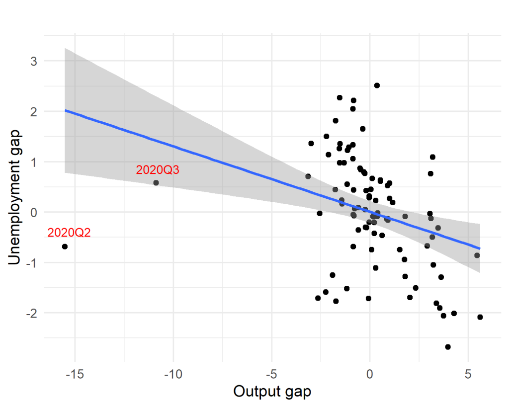
The report presents the gap scatter as supportive of the basic Okun intuition: the relationship slopes in the expected direction, with output slack mapping into labour-market slack. The attraction of the gap scatter is that it often looks “tighter” than the first-difference scatter, precisely because it focuses on cyclical deviations and strips out long-run drift.
But the report also insists on the obvious and inconvenient fact: extreme quarters matter. It identifies outliers associated with the global financial crisis and the COVID period (and highlights that some quarters during these episodes combine sharp GDP movement with relatively muted unemployment changes, or vice versa). Economically, this is telling. It suggests that the labour market does not respond one-for-one to output in every shock. Institutional buffers, timing, sectoral composition, labour hoarding, and policy measures can all distort the immediate mapping, especially during extraordinary events.
This is where the quarterly frequency becomes both useful and humbling. Useful because it allows the analyst to identify precisely which quarters are exerting influence. Humbling because those influential points are not statistical “noise”; they are the moments when the economy behaves differently. In policy terms, those are the quarters everyone cares about most, yet they are also the quarters least likely to fit a stable linear relationship.
8. Piecewise regression: One Okun slope is often a polite fiction
The report does something rare in applied macro work: it uses a visual piecewise regression analysis to show how the relationship may have shifted over time rather than simply asserting “instability” as a generic caveat. The economic motivation is clear: if the economy passes through distinct regimes, boom, prolonged recession, recovery, pandemic shock, the Okun relationship may change in strength, timing, or even form.
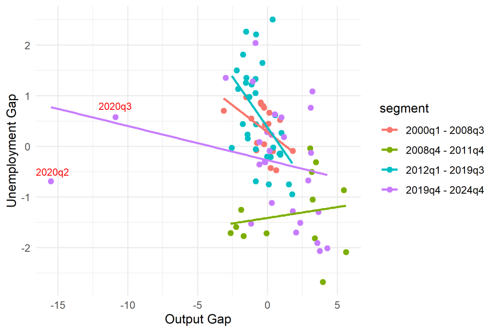
As shown in Figure 8 the piecewise visual is the report’s way of saying: do not assume that Croatia’s output-gap-to-unemployment-gap mapping has been constant from 2000Q1 to 2024Q4. It suggests that the relationship’s slope and tightness can vary across subperiods, reinforcing the earlier lesson from the time-series plots: shocks do not merely move the economy along a stable line; they can bend the line itself.
For a reader with a policy flavour, the implication is immediate. If Okun’s coefficient changes across regimes, then “how much growth (or slack reduction) is needed to lower unemployment” is not a universal rule. It is a conditional statement. It may be stronger in certain downturns, weaker in certain recoveries, and sensitive to institutional context. That does not make Okun’s Law useless. It makes it realistic: a rule-of-thumb, not a law of nature.
9. What the graphical evidence can conclude, and what it must not
At this stage, before the report’s formal tests, what can we responsibly infer?
We can infer that Croatia’s quarterly data is broadly consistent with Okun’s intuition. Output and unemployment move inversely in the big narrative sense. In first differences, major output shocks align with sharp unemployment movement. In gap terms, cyclical slack in output aligns with cyclical slack in unemployment, and the gap framing appears particularly well-suited for telling a policy-relevant story.
We can also infer that Croatia’s Okun relationship is unlikely to be a single stable line. The report’s own emphasis on major episodes, visible outliers, and the piecewise regression analysis all point to potential instability. The data suggests timing effects and persistence, unemployment behaving more sluggishly than output in recovery phases, and more sharply in downturns. These are not technicalities; they are the economic substance of why “growth is back” does not always translate into “jobs are back” on the same schedule.
What we cannot do yet is declare “verification” or “breakdown.” Graphs can hint at relationships, and they can highlight where relationships are strained, but they cannot tell us whether the variables are statistically well-behaved, whether breaks are formally detectable, whether long-run equilibrium relationships exist, or whether predictive direction runs from output to unemployment or the reverse. Those are the questions Part II is designed to tackle.
10. Bridge to Part II: Where the cross-examination begins
Part I’s pictures whisper a plausible Okun story for Croatia, especially when told in the language of gaps and slack. But they also whisper something else: the relationship is shaped by regime changes, extreme quarters, and the possibility that a single coefficient averages away the very episodes policymakers care about most. Part II starts exactly where this part stops: with the report’s formal testing sequence. It will ask whether the series are stationary or drifting, whether structural breaks are statistically evident, whether output and unemployment share a long-run tether under cointegration frameworks, how dynamic models (including ARDL and asymmetric NARDL) interpret adjustment, and what the causality evidence says about who leads whom. In short: the charts have made the case for curiosity. The tests will decide how much confidence that curiosity deserves.