In this blog post graphic methods are used to describe monthly dinar exchange rate and its first difference time series for six currencies.
Two types of a line graph could be used to show changes in dinar exchange rates over time. The first displays dinar exchange rates for six currencies on a single graph. Because these time series are overlapping not much could be inferred from such graph. The second type of graph displays each series on a separate panel. On such graph any persistent pattern related to trend or seasonal factors should be visible.
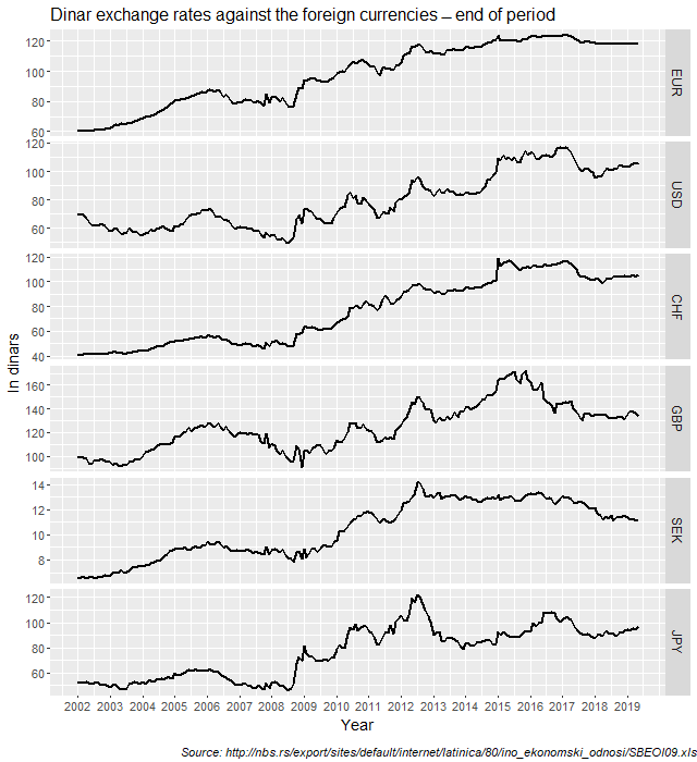
Figure 1 shows line graphs of monthly dinar exchange rate for six currencies on the same panel.

Line graphs in Figure 1 show that most of the most series have an increasing trend since 2008 with lots of variation around such trend. However, in the last three years this trend is reversing and while some currencies are showing variation around constant level, other are showing negative trend. Additional data in the next few months will tell us if this could be a long lasting tendency. These features of the dinar exchange rate series are even more obvious from the line graphs in Figure 2. Figure 2 shows line graphs of dinar exchange rates for six currencies, but this time on a separate panels.

Figure 3 shows line graphs of the first differences of dinar exchange rates for six currencies on a separate panels. All currencies are showing a significant volatility during the great economic crisis in 2008. A slightly lower level of volatility lasted at least 3 more years. Since 2014 volatility of dinar exchange rates reduced with a few sharp blips in 2015, particularly in case of Swiss franc (CHF).

We can further examine the first differences of dinar exchange rates for these currencies by using summary graphs such as histograms (Figure 4), boxplots (Figure 5) and quantile-quantile plots (Figure 6). The shapes of the first differences of dinar exchange rate distributions are clearly visible on histograms showing that the positive rates are dominating the distribution as well as a few positive outliers. These outliers are shown as separate data points in Figure 5 where boxplots are presented. We call such distributions right skewed distributions or distribution with positive skewness.
Positive skewness implies that the right tail of the distribution is fatter than the left tail which indicates that positive first differences of dinar exchange rates tend to occur more often than large negative values. Positive skewness values might point to possible trading opportunities on the foreign currency market.

(histograms and density curves)
By comparing boxplots in Figure 5 it is obvious that USD and JPY currencies are the most volatile (greater height of their boxes plus larger and numbered outliers). The least volatile currency is EUR. Most of boxplots show more positive outliers than negative, while boxplot for GBP is the only one with more negative outliers. We know from Figure 3 that these extreme data points are mostly recorded during the economic crisis in 2008.

The quantile-quantile plot (QQ-plot) gives a graphical comparison of the empirical quantiles of the first differences of dinar exchange rates to those from a specified reference distribution, i.e. normal distribution in this case. If the quantiles exactly match up then the QQ-plot is a straight line. If the quantiles do not match up, then the shape of the QQ-plot indicates which features of the data are not captured by the reference distribution. Usually it is the daily data that would have much fatter tails than the normal distribution. In that case QQ-plot would have S shape. However, if we increase the time scale over which the first differences of dinar exchange rates are calculated, then our distribution looks more and more like a normal distribution. This is what we have obtained in Figure 6 where probably only in case of EUR we have S shaped QQ-plot. In all the other QQ-plots we can see deviation from normal distribution and lots of extreme values, but not to such extent that we would have if the daily data are used. This would be further investigated using daily exchange rates and some formal statistical tests.


