Okun goes Balkan: Growth, jobs and the former Yugoslavia’s uneasy dance – Part I
1. A “law” arrives in a region that rarely does averages
Okun’s Law is usually introduced as a tidy proposition: when output grows, unemployment tends to fall; when output contracts, joblessness rises. The report treats that proposition for what it is, an empirical regularity whose strength and stability depend on economic structure, institutions, and labour-market dynamics. It then asks a pointed question in a region where “structure” and “history” are not footnotes: does the growth–unemployment relationship behave like a shared regional pattern, or does it dissolve into country-specific stories once you look closely?
The setting is the six independent states that emerged from the Socialist Federal Republic of Yugoslavia: Bosnia and Herzegovina, Croatia, Montenegro, North Macedonia, Serbia, and Slovenia. The report underlines why this is a “unique regional context”: the countries share legacies and linkages, but their post-1990 trajectories diverge sharply, shaped by conflict, post-conflict recovery, market transition, EU integration processes, and global shocks. That diversity is exactly what makes the exercise informative: if Okun’s Law is ever going to reveal what it’s made of, it will do so when confronted with labour markets at different stages of institutional maturity and economic development.
Crucially, the report does not treat the exercise as a single regression that will proclaim “law” or “no law”. It lays out two conceptual formulations, one short-run and one “gap” based, and then begins with something more basic but often more revealing: a visual tour of how output and unemployment actually move in each country, before formal testing begins.
2. What the data are, and what they are not
The report uses annual panel data covering the period from 1990 to 2024, organised as an unbalanced panel across the six countries. It focuses on real GDP per capita (in PPP terms, constant 2021 international dollars) and unemployment (total unemployment as a share of the labour force, modelled ILO estimate), sourced from Eurostat. For the analysis it works largely with a log transform of GDP (LGDP) and first differences (DLGDP), alongside the unemployment rate (UR) and its first difference (DUR).
A practical complication, important for panels but also revealing in itself, is that availability differs by country. The report notes that the longest common span across all countries is 1997–2023; within that window, the panel is balanced and suitable for procedures that require balanced data. Outside it, the analysis uses the full available series where appropriate, and in particular uses all available data when estimating unobserved components such as “potential output” or the “natural rate of unemployment”. The message is straightforward: the panel is rich, but it is not perfectly symmetric, and the analysis must respect that.
The report also makes an explicit choice for the “gap” approach: it constructs output and unemployment gaps using the Hodrick–Prescott filter. Here, the intent is conceptual rather than mystical: the output gap is defined as the difference between actual GDP and the HP trend component (potential output), while the unemployment gap is the difference between actual unemployment and the HP trend component (the natural rate of unemployment). These are cyclical deviations from long-run trends, and they are meant to capture “operating above/below sustainable levels” more directly than raw changes alone. The report flags, however, that gap measures can be sensitive to filtering choices and end-of-sample issues, an admonition that will matter later, but already shadows the visuals.
Finally, a brief but telling line appears: the empirical analysis was conducted in Stata, EViews, and R. It is not a software tutorial. It is simply a signal that the workflow is intended to be replicable in standard toolchains, and that the evidence presented in the figures is meant to be a foundation rather than decoration.
3. Two ways to tell Okun’s story, before the tests arrive
The report frames the empirical investigation around two versions of Okun’s Law. The first is the “first difference” model: it focuses on the short-term cyclical association between annual GDP growth (captured via changes in log GDP) and changes in unemployment. This version is explicitly described as useful for detecting immediate labour-market responses to fluctuations in economic activity, though it may miss longer-run or structural deviations. The second is the “gap” model: it links the unemployment gap to the output gap, both measured as deviations from longer-run trends, and is designed to speak to whether economies are operating above or below sustainable levels and how that translates into labour-market slack.
Part I of blog posts does not yet try to “verify” the relationship econometrically. Instead, it treats the graphical evidence as a disciplined first pass: do the series look like they have the right kind of co-movement? Do patterns appear consistent across countries? Do the signs and timing look plausible? And, this matters, does reverse causality look as weak as textbooks sometimes assume, or does the region offer surprises?
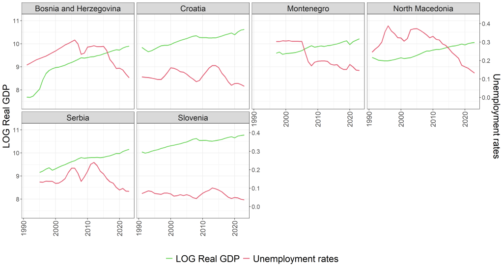
4. The visual story, Act I: Levels and their inconvenient lags
The graphical analysis begins with levels: log GDP per capita (LGDP) and the unemployment rate (UR) plotted over time for each country. The report notes an upward trend in real GDP across all six countries, an unsurprising sign of long-run growth, but emphasises differences in smoothness and volatility. Some countries show relatively stable and continuous growth, while others exhibit greater volatility that plausibly reflects the region’s turbulent political and economic transitions. On the unemployment side, the series are described as more variable and cyclical, with some countries showing a relatively steady decline after the early 2000s and others displaying persistently high levels. The report’s key interpretive sentence is the one that should make any Okun reader sit up: GDP looks smoother; unemployment responds more slowly and with greater volatility, suggesting potential lags or rigidities in labour markets, features often associated with transition contexts.
As shown in Figure 1, the point is not that GDP and unemployment move in opposite directions day by day. The point is that unemployment seems to have its own rhythm: more noise, more persistence, and a tendency to react with delay. If Okun’s Law is going to hold here, it may do so through a channel that is less immediate than the tidy classroom version.
5. Act II: First differences, the Okun claim in its most recognisable costume
The report then shifts to first differences: the first difference of log GDP and the first difference of the unemployment rate, which effectively correspond to annual GDP growth and annual changes in unemployment. This is the “short-run” stage on which Okun’s Law is typically judged: growth down, unemployment up; growth up, unemployment down.
As shown in Figure 2, the report describes GDP growth as sharper and more irregular, while unemployment changes are “relatively more stable but noisy.” In other words, output is the impulsive one; unemployment is the reluctant follower. The report points to pronounced output contractions during major crises (it explicitly mentions the 2008 financial crisis and the COVID-19 pandemic) and notes that these are mirrored by spikes or slowdowns in unemployment improvements. It is careful not to claim perfect synchrony, but it does claim something important: in many instances where GDP growth is negative or declining, unemployment increases or fails to decrease, particularly visible in the early 1990s and 2009–2010 across multiple countries. That pattern aligns with the core prediction of Okun’s Law and provides preliminary visual evidence of an inverse short-run relationship.
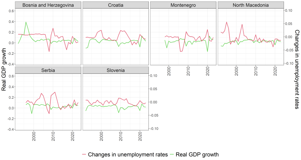
If Figure 1 warns you that unemployment is a laggy variable with a long memory, Figure 2 suggests that, even so, the cyclical logic is not absent. When output falls hard enough, unemployment does not merely shrug. It reacts, sometimes sharply, sometimes slowly, but rarely not at all. That matters for policy narratives, because the “growth will fix the labour market” mantra only works if the link is not purely aspirational.
6. Act III: The gap measures, slack as a state, not a change
The report then constructs output and unemployment gaps using the Hodrick–Prescott filter, defining the output gap as the difference between actual GDP and HP trend GDP, and the unemployment gap as the difference between actual unemployment and HP trend unemployment. This is a conceptual shift: rather than asking whether a change in output maps to a change in unemployment, the gap model asks whether being above or below “potential” output maps to being below or above a “natural” unemployment rate. In the report’s framing, this is about long-run sustainability and cyclical slack.
As shown in Figure 3, the report emphasises a notable feature across all countries: output and unemployment gaps exhibit clear cyclical co-movement, often in opposite directions. Periods of negative output gaps (actual below potential) are associated with positive unemployment gaps (above-trend unemployment). This inverse cyclical pattern is described as broadly consistent with Okun’s Law, with some countries showing clearer alignment and others showing noisier, more ambiguous relationships, possibly linked to measurement issues, labour market frictions, or differences in economic structure. Even without any regression yet, the gap visuals serve as a kind of plausibility check: when the economy is “below trend,” unemployment tends to sit “above trend,” as one would expect.
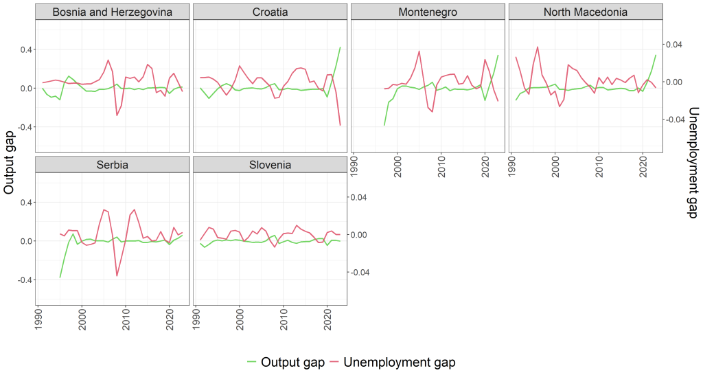
The report also quietly plants a methodological warning that doubles as an economic warning: gap measures can be volatile and sensitive to the filtering technique and the assumptions underlying it. That is not merely a technical caveat. If policy discussions lean on “slack” measures, then the credibility of those measures matters. A gap model may be conceptually strong, but conceptually strong models can still be empirically fragile if their inputs are fragile. The report will return to this later; the figures already hint at it.
7. The scatterplots: Okun’s slope appears unevenly
Having walked through time series plots, the report then turns to scatterplots and simple linear regressions. This is still graphical analysis, but it begins to edge toward inference: do the clouds of points line up in a way that suggests a stable negative relationship, and does that relationship look stronger in the first-difference model or the gap model?
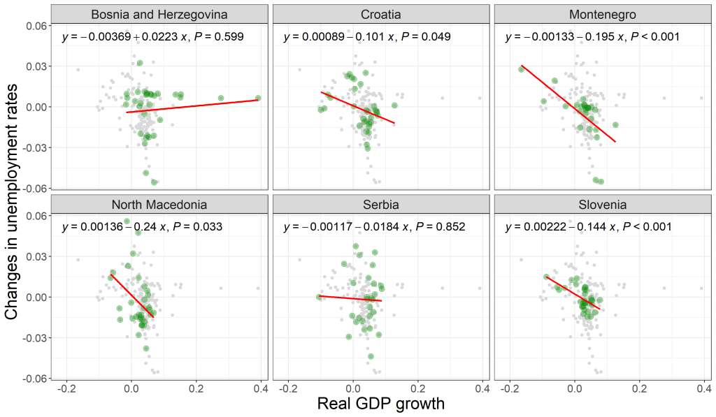
7.1 First-difference model, forward direction: the classic Okun test
As shown in Figure 4, the report presents scatterplots for the first-difference model, regressing changes in unemployment on GDP growth for each country. Each facet focuses on one country, while the data from other countries are shown in grey for context. This is an important design choice: it encourages the reader to see both the national relationship and the regional “background noise” against which that relationship is drawn.
The report’s headline result from this figure is qualitative but consequential: the negative slope appears clearly in several countries, and in those cases the coefficients are statistically significant at the 5% level. In other countries, the relationship appears weaker and statistically insignificant, even if the scatter seems loosely aligned with a negative trend. The economic implication is immediate: the same “growth shock” may translate into a stronger or weaker labour-market response depending on country-specific factors—whether labour markets are flexible, whether adjustment happens through unemployment or participation, whether data quality differs, and whether institutional settings change the way firms respond to demand. The report does not yet adjudicate among these; it simply shows that the slope is not uniform across the region.
7.2 Gap model, forward direction: Conceptually strong, empirically temperamental
The gap version is shown in Figure 5, which illustrates the relationship between the output gap and unemployment gap. The report again observes a negative slope in most countries, but it also notes something more selective: only some countries exhibit statistically significant Okun coefficients in this gap setting. Compared with the first-difference model, the gap model is described as more volatile, likely reflecting sensitivity to the filtering technique and the assumptions underlying the HP filter. Where the inverse relationship is clear and well-defined, the scatterplots align; where it is not, dispersion dominates. The report’s interpretation is careful: higher-than-trend activity is generally associated with below-trend unemployment, consistent with expectations, but the model may suffer from over-smoothing or endpoint bias in smaller samples, especially where historical data are less reliable.
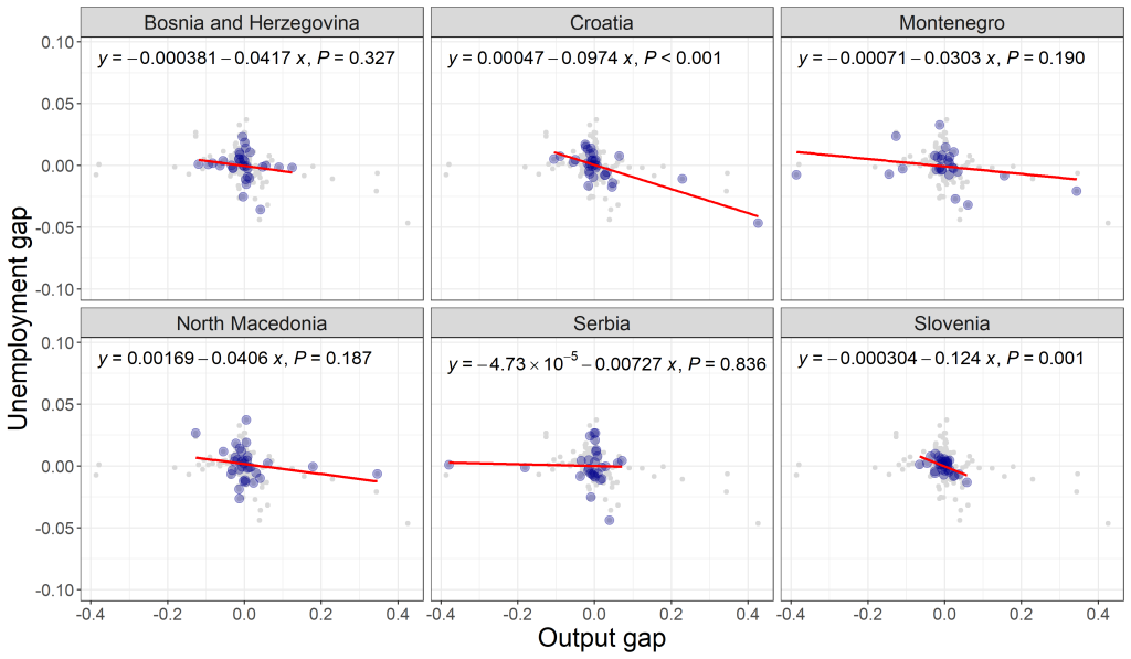
Economically, the contrast between Figures 4 and 5 matters. The first-difference model asks a narrow question, what happens to unemployment when growth changes this year?, and often looks “cleaner” because it focuses on changes. The gap model asks a broader question, what does cyclical slack do to cyclical unemployment?, but that breadth comes with measurement vulnerability. In a region where the past is not merely the past but a sequence of regime shifts, a gap measure may be conceptually attractive yet empirically twitchy.
8. Reverse causality in pictures: when the arrow points back
Okun’s Law is usually narrated with output leading unemployment. The report does not assume that direction. It tests the reverse visually as well, using scatterplots to examine whether unemployment affects GDP growth (Figure 6) and whether unemployment gaps relate to output gaps in the reverse direction (Figure 7).
As shown in Figure 6, the report describes the reverse-causality scatterplots as generally weak and ambiguous, with no clear consistent pattern across most countries. Even where the forward relationship looked strong in some cases, the reverse relationship is described as much less pronounced. The report’s interpretation is restrained but clear: changes in unemployment may not be a reliable predictor of GDP growth at annual frequency in this dataset.
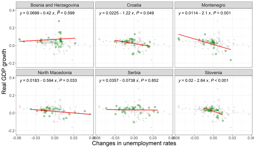
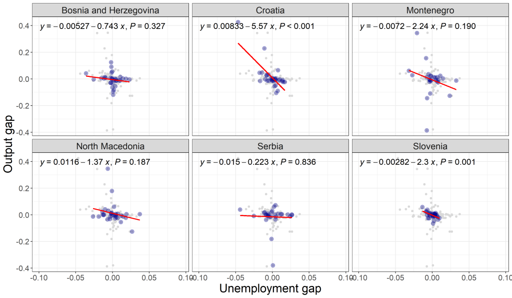
Figure 7 reinforces that impression for the gap model. The report notes that, although unemployment gaps might theoretically influence output gaps via labour-supply channels, the empirical evidence in these visuals is mixed at best: regression lines are often flat or statistically insignificant, and the scatter lacks the alignment seen in the forward-direction figures. The key message is not that reverse causality never exists. It is that, in this annual dataset and this regional context, the reverse visual signal is weaker and more conditional than the forward one.
9. What Part I concludes, and what it refuses to conclude
By the end of the graphical analysis, the report offers a summary that is both encouraging and properly cautious. The evidence is “mixed but generally supportive” of the core proposition that growth and unemployment are inversely related. That relationship appears stronger in the first-difference model than in the gap model, and it appears more robust when causality is framed from output to unemployment rather than the other way around. It also emphasises cross-country differences: some countries conform more consistently to theoretical expectations, while others show weaker or noisier patterns. The report highlights the likely relevance of labour market flexibility, data quality, and stage of economic development in shaping the empirical validity of such relationships.
This is not a trivial conclusion, because it sets the tone for what comes next. If the visuals already show heterogeneity, stronger slopes here, weaker relationships there, then any serious empirical verification will need to respect that heterogeneity rather than steamroll it. Likewise, if the gap model looks more fragile, then later results must be read with an eye to how sensitive “slack” measures can be in annual data and in economies with structural change.
In short, Part I tells a story that policymakers will recognise and researchers will appreciate: the Okun mechanism seems present, but not uniform; more visible in short-run changes than in filtered gaps; and more convincing in the forward direction than the reverse, at least before formal testing begins.
10. Teaser: from pictures to proof
Part I ends where the temptation usually begins: to infer too much from attractive graphs. The report does not take that shortcut. It treats the visuals as an informed preface, not a verdict.
Part II, therefore, moves from pictures to proof, or at least to disciplined testing, by applying panel unit root tests, cross-sectional dependence checks, heterogeneity considerations, and then proceeding through the econometric toolkit to cointegration and causality results. In other words, the analysis will ask whether the visual relationships survive the methodological scrutiny required for panel macro data in a tightly linked region.