In this blog post graphic methods are used to describe monthly consumer price index and inflation time series in six countries.
Two types of a line graph could be used to show changes in monthly consumer price index and inflation over time. The first displays consumer price index for six countries on a single graph. This graph type won’t be used for inflation series because all series oscillate around zero. That means the series would overlap each other and not much could be inferred from such graph.
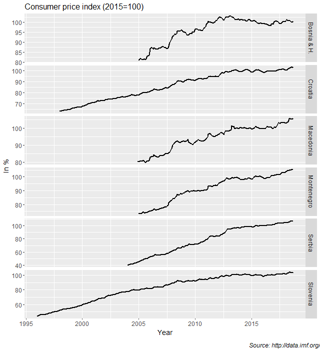
The second type of graph displays each series on a separate panel. On such graph any persistent pattern related to trend or seasonal factors should be visible.
Figure 1 shows line graphs of monthly consumer price index for six countries on the same panel.

Line graphs in Figure I show that slopes of most series decreases after 2013. However, the rates at what the consumer price index series slowing down are different. These features of the consumer price index series are even more obvious from the line graphs in Figure 2. Figure 2 shows line graphs of consumer price index for six countries, but this time on a separate panels.

Figure 3 shows line graphs of inflation for six countries on a separate panels. We can see that in case of Bosnia and Herzegovina, Macedonia, and Serbia and to some extent in case of Montenegro inflation rates came down after 2013. Volatility of inflation in these countries reduced, while in case of Croatia and Slovenia this volatility stayed almost the same. Another feature is visible on the panels of Croatia, Montenegro, and Slovenia and to some extent in case of Serbia. From the beginning and usually until 2013, each of these series shows that inflation rates were almost all the time above zero. After 2013, particularly in case of inflation in Slovenia, positive rate in one month is usually followed by negative rate in the following month.

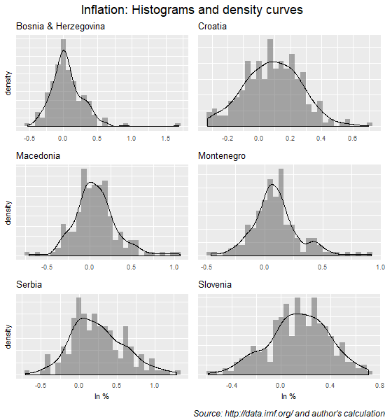
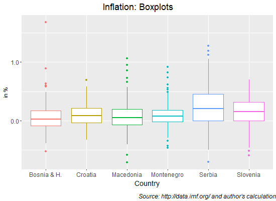
We can further examine inflation rates in these countries by using summary graphs such as histograms (Figure 4) and boxplots (Figure 5). The shapes of inflation distribution are clearly visible on histograms showing that the positive rates are dominating the distribution as well a few positive outliers. These outliers are shown as separate data points in Figure 5 where boxplots are presented.

By comparing boxplots in Figure 5 it is obvious that Serbian inflation is the most volatile and has the largest median inflation rate followed by Slovenian inflation. Most of boxplots show positive outliers, while boxplot for Slovenia is the only one with only negative outliers. Macedonia and Montenegro inflation series have more positive and negative outliers than the other countries, illustrating the volatile nature of these series. We know from Figure 3 that these extreme data points are mostly recorded at the beginning of observed period in each country.


