
Zagreb at the centre, counties in the mirror: Croatia’s Okun Law looks different up close – Part I
When you zoom in from the capital to the periphery, the “law” turns into a patchwork of lags, resilience, and slack.
The methodology pipeline behind this exercise, why we test stationarity, dependence, cointegration, dynamics and causality in that order, was explained in a separate blog post. This counties series runs in three parts: Part I reads the pictures, Part II walks through the formal panel results, and Part III synthesises what it all means for policy.
1. Why a county lens changes Okun’s Law
Okun’s Law is often treated as a national shorthand: when output rises, unemployment tends to fall; when recessions hit, joblessness rises. It’s a convenient regularity, useful enough to guide expectations, vague enough to survive contact with reality. But the moment you replace “country” with “county”, the story becomes more interesting and more awkward. Croatia is not one labour market. It is a mosaic of local economies with different industrial structures, different exposure to shocks, and different capacity to absorb or shed workers.
That is the report’s starting point. Instead of asking whether Croatia has an Okun curve, it asks whether Croatia has many Okun curves, some steep, some flat, some clearly visible only in bad years, and some blurred by idiosyncrasies. This is not a purely statistical question. It is a practical one. If the Okun channel differs across counties, then a national policy narrative, “growth will bring jobs”, is not wrong, but it can be unevenly true. The capital may live in a different macro economy from parts of Slavonia, or from counties whose fortunes rise and fall with tourism, industry, or long-run demographic constraints.
The report therefore uses the county panel as a way to make the Okun relationship more honest. The goal of Part I is not to “prove” anything; it is to show what the data look like before the formal machinery begins. Visual evidence is not a verdict, but it is a very good cross-examination. It shows where the relationship is obvious, where it is delayed, where it appears only in crisis years, and where it varies across space.
2. Two Okuns, one country: Changes and gaps
The report works with two standard ways of expressing Okun’s Law, and the distinction matters even more at the county level.
The first is the first-difference specification. In plain English, this asks whether GDP growth tends to go with falls in unemployment, and whether contractions go with rising unemployment. In the county setting, it is a test of short-run sensitivity: when local output turns down, do local labour markets react sharply, mildly, or not at all?
The second is the gap specification. Here, the report constructs an output gap and an unemployment gap for each county and then examines whether above-trend output aligns with below-trend unemployment (and vice versa). This is the language of slack: not “is unemployment high?”, but “is unemployment high relative to its local trend?” The report extracts these cyclical components using the Hodrick–Prescott filter. The mechanics are not the point; the point is what the gap lens does conceptually. It shifts attention from raw levels and short-run changes toward cyclical deviations, the kind of “overheating” and “slack” that stabilisation stories are built around.
In a geographically diverse economy, that can be especially helpful. Counties are not just smaller Croatias; they have different typical unemployment rates and different trend growth paths. A gap lens tries to compare each county to its own “normal”, rather than forcing them into one national baseline. That makes it easier to see whether local labour markets move procyclically, even if their average conditions differ.
The report uses both models throughout the graphical analysis. But it also makes a clear suggestion by the way the visuals behave: the gap model often produces a cleaner, more consistent picture of the Okun relationship across counties than the first-difference model does. That does not mean the difference model is wrong. It means the difference model is noisier, and in a county panel noise is not evenly distributed.
3. The long view: levels across counties and the anatomy of persistence
The report first shows the levels of log GDP and unemployment rate for each county over the long run (Figure 1), which immediately answers two questions that a national aggregate hides: how different are local growth paths, and how persistent are local labour-market conditions?
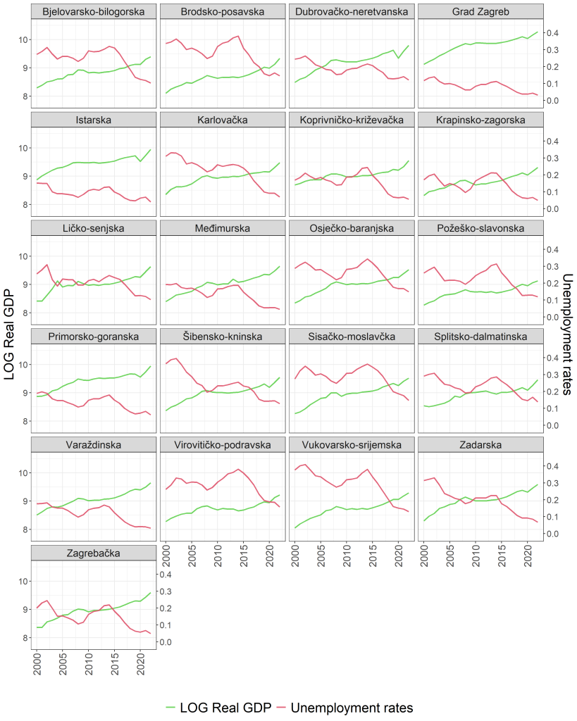
The report’s interpretation is direct and spatially grounded. The log GDP series show a generally upward trend across counties, with visible dips around the 2008–2009 Global Financial Crisis and the COVID-19 pandemic. Unemployment rates are more volatile and more heterogeneous. Some counties—such as City of Zagreb and Primorje-Gorski Kotar, show relatively low and stable unemployment. Others, such as Vukovar-Srijem or Brod-Posavina, show persistently higher and more fluctuating unemployment.
Two broad points emerge from this long view, and both are core to why the county lens matters.
First, the Okun story is partly about timing. The report notes that unemployment spikes tend to follow output downturns, suggesting a lagged response typical of Okun-type dynamics. The county plots make the lag visible: output can dip sharply, while unemployment reacts with delay and sometimes with persistence.
Second, county “structure” shows up in the stability of the labour market. The report observes that counties with larger, more urban economies experienced smoother growth and more stable labour markets, whereas less developed or war-affected regions faced persistent labour-market challenges. That is not an econometric footnote; it is the key to interpreting any later “Okun coefficient” differences. Where labour markets are structurally strained, output recoveries may not translate smoothly into employment improvements. Where economies are more diversified and resilient, the labour market can be less volatile.
This is also where Zagreb’s role should be understood correctly. In this post the capital is a narrative anchor, because readers expect it, but it is not the story’s whole point. The visual evidence is telling us that Croatia’s local economies are not merely smaller versions of Zagreb. Some counties look like they are operating under different constraints entirely.
4. Year-to-year sensitivity: The first-difference picture and why it fragments across space
Levels are informative, but Okun’s Law is often discussed in change terms: growth up, unemployment down. The report therefore plots first differences of log GDP and unemployment rates by counties (Figure 2), to capture GDP growth and changes in unemployment rates.
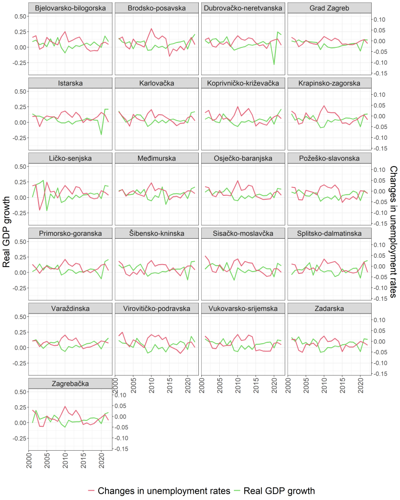
The report’s reading is intuitive. Volatility becomes more pronounced in differences, especially during recession periods. The 2009 contraction and subsequent rebound appear across most counties: GDP growth turns sharply negative and unemployment rises. But again the county lens reveals uneven sensitivity. City of Zagreb and wealthier coastal counties show relatively muted reactions, while counties such as Sisak-Moslavina and Virovitica-Podravina exhibit sharper fluctuations.
This figure does not “estimate” Okun’s Law; it shows the environment in which any estimation must operate. Short-run movements are shaped not only by the cycle but by local exposure and resilience. In some counties, output shocks look like they pass through the labour market quickly. In others, the labour-market response appears either dampened (perhaps because adjustment occurs through other margins) or noisy (perhaps because small local economies are more vulnerable to idiosyncratic disturbances).
The difference model therefore has a predictable problem in county panels: it can be conceptually appealing but empirically fragile. When one county’s quarterly changes are dominated by local events, the regression line becomes a poor narrator. The report will later show this in scatterplots and in significance patterns. But even here the implication is clear: the first-difference Okun story is likely to be uneven across counties, with the relationship becoming strongest during big shocks and weaker in ordinary times.
5. Slack makes the cycle visible: Output and unemployment gaps across counties
To move from “short-run changes” to “cyclical slack”, the report constructs output and unemployment gaps using the Hodrick–Prescott filter and plots them for each county (Figure 3).
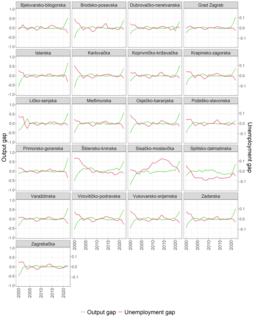
This is the report’s most explicitly “Okun” figure in the graphical section. It uses gap series to show deviations from long-term trends, and it finds that for most counties the output and unemployment gaps display strong negative co-movement: above-trend output tends to align with below-trend unemployment, consistent with Okun’s Law. Peaks in the unemployment gap often mirror troughs in the output gap during recessionary periods such as 2009 and 2020.
The report also highlights why county heterogeneity matters: the size and frequency of cycles vary substantially across counties, reflecting structural economic diversity. In other words, the Okun channel may be present everywhere in theory, but it expresses itself differently depending on local economic structure and shock exposure.
This is where the gap model earns its keep. It is not that it magically creates a relationship; it often makes the relationship easier to see because it strips out long-run drift and focuses on cyclical deviations. In county data, that is a particularly meaningful adjustment because counties differ widely in their trend levels of unemployment and in their trend growth paths. A gap model says: each county has its own “normal”; how does it deviate from that normal during booms and busts?
The report uses this as an argument for studying both gap and difference models. But it also implies something stronger: the gap model is likely to be the more coherent way to compare counties, because it speaks the language of slack rather than the language of raw changes that can be heavily contaminated by local noise.
6. Scatterplots by counties: Where Okun is visible, and where it refuses to pose for the camera
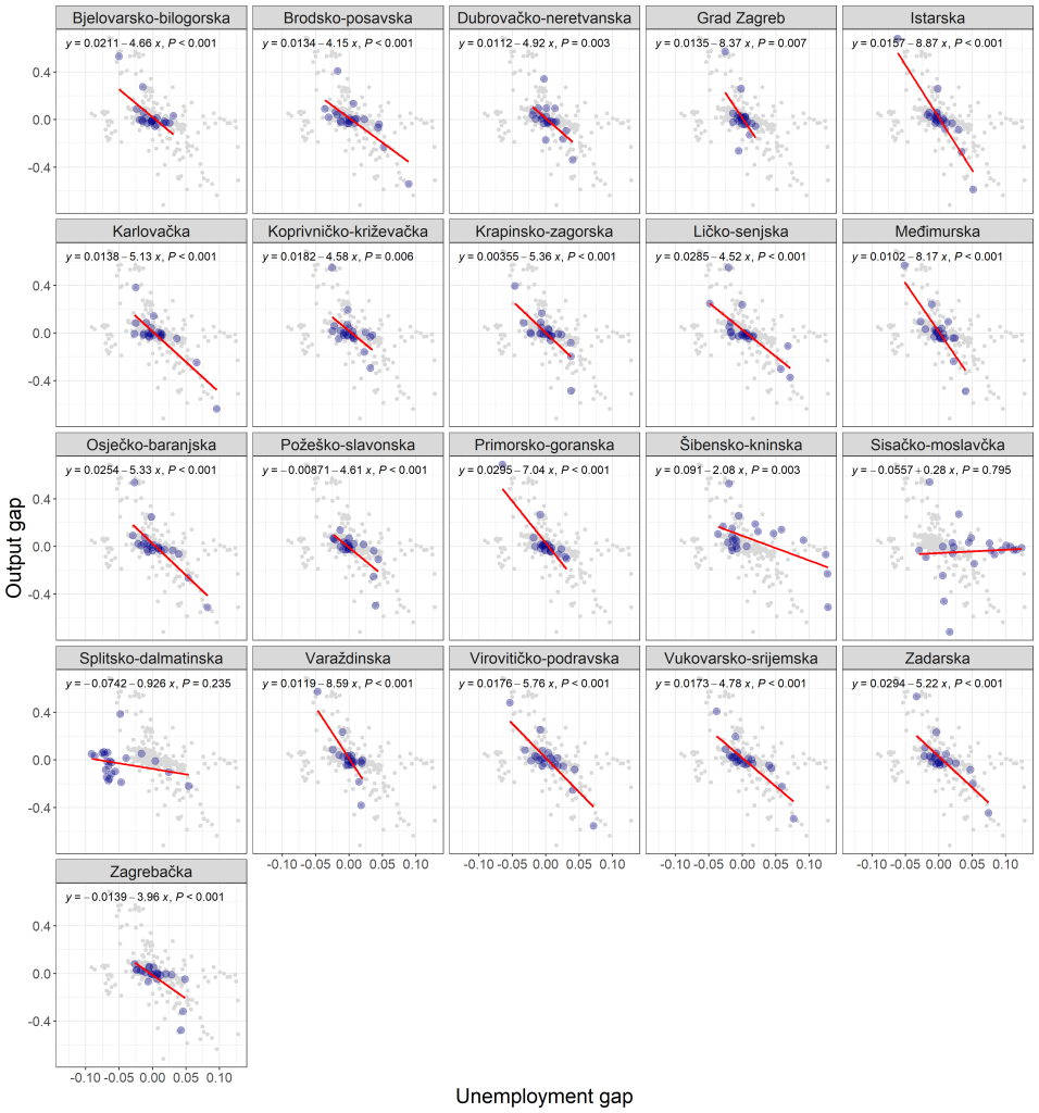
After the time-series plots, the report turns to scatterplots that pair the variables in ways that correspond to the two Okun specifications. In a county panel, scatterplots do two things at once: they reveal whether a local relationship looks linear and stable, and they show how much of the relationship is driven by a handful of extreme observations.
As shown in Figure 4 the report provides scatterplots for both the first-difference model and the gap model. Following the “prioritise gap visuals but comment on both” rule, this post uses gap-model scatterplots as the primary visual anchors while still describing what the difference-model scatterplots show.
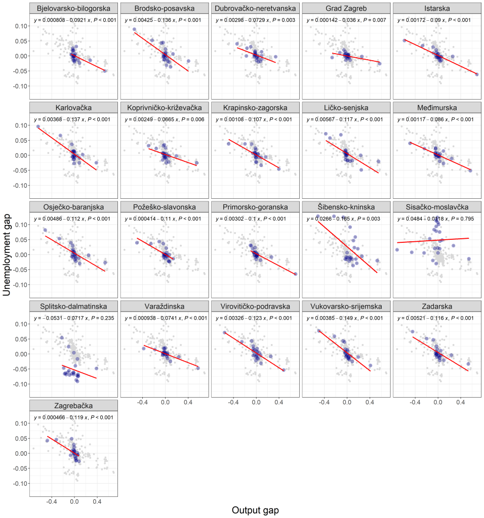
The report describes the gap-model county scatterplots as visually consistent with Okun’s Law: a negative relationship, where more negative output gaps align with more positive unemployment gaps. Importantly, the gap scatterplots also let the reader see how the relationship differs across counties. Some counties show a clearer pattern; others show more dispersion.
The difference-model county scatterplots (shown elsewhere in the graphical block) tell a less uniform story. The report notes that the inverse relationship in the first-difference specification is not robust across all counties: only a small subset show statistically significant Okun coefficients, while others appear noisy or insignificant. It cites City of Zagreb and Istria as counties with clearer negative associations and points to others, such as Lika-Senj and Požega-Slavonia, as places where patterns are noisier. It also notes that crisis years cluster in particular regions of the scatter, with more frequent combinations of low GDP growth and rising unemployment.
The economic takeaway from comparing these visuals is not hard to state: Okun’s Law is easier to see in cyclical slack than in quarter-to-quarter changes, and it is easier to see in some counties than in others. The difference model can still be meaningful, especially during large shocks, but as a general county-by-county diagnostic it can understate the relationship because of noise and timing. The gap model looks more like a structural relationship because it frames each county’s cycle relative to its own trend.
7. Scatterplots by year: When the national shock synchronises the counties
The report then flips the scatterplot lens. Instead of “one panel per county,” it shows “one panel per year,” plotting the relationship across counties within each year (Figure 5). This is a clever way to answer a different question: not “does each county have Okun dynamics?”, but “in which years does the relationship show up most clearly across the country?”
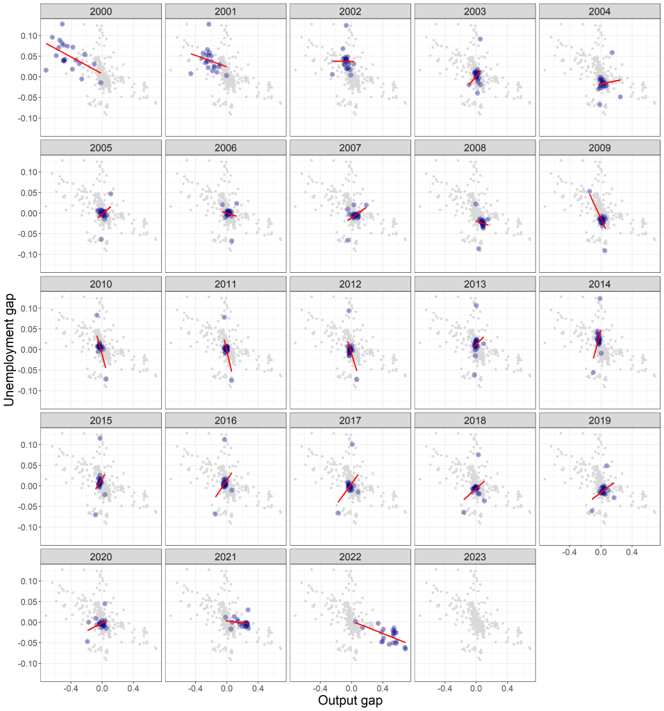
The report’s interpretation is crisp. Years with large negative output gaps, such as 2009 and 2020, are also years with large positive unemployment gaps, confirming procyclical labour-market behaviour. In those years the regression slopes are markedly negative, while in stable years the slopes flatten. The implication is that Okun’s Law is more prominent during downturns.
The report makes an analogous point for the first-difference year-based scatterplots: downturn years show stronger negative slopes, while expansionary years show weaker or inconsistent patterns. In other words, in good times, county differences and local idiosyncrasies can dominate. In bad times, the macro shock becomes a synchronising force, and the Okun relationship becomes more visible across space. This supports a common-sense interpretation: recessions are when output constraints bind broadly and labour-market slack rises widely; expansions distribute gains more unevenly.
From a policy angle, this is important. It suggests that national downturns activate a more uniform “macro” Okun channel across counties, while normal times are more influenced by local structures and local constraints. County heterogeneity is therefore not constant; it is state-dependent.
8. The “reverse” relationship: Unemployment as predictor of output, and why it looks different in gaps
The report also examines the reverse mapping: changes in unemployment as predictors of GDP growth, and unemployment gaps as predictors of output gaps. This is not the theoretical core of Okun’s Law, but it is empirically interesting. It asks whether the labour market contains information that predicts output movements, especially at the local level.
In the first-difference reverse analysis, the report notes weak evidence: only five counties show statistically significant relationships and the annual year-based scatter shows only slight negative associations in some years. This is described as unsurprising, because Okun’s Law is typically framed with causality running from output to unemployment.
As shown in Figure 6 the gap-based reverse analysis, however, appears stronger in the report’s graphical discussion. It states that in the gap model reverse analysis at the county level, most counties display statistically significant relationships (19 of them), with Okun coefficients varying widely across counties. That wide dispersion is itself an economic story: even when the reverse mapping shows up in the gap framework, it does not show up uniformly. Some counties appear far more responsive than others in the implied relationship.
This is where the county panel produces a nuanced message. The reverse mapping in gaps can show strong statistical patterns, but the report treats it as evidence that the gap model better captures the structural linkage between the labour market and economic activity, even when explored in the reverse direction, rather than as a claim that unemployment “causes” output in a deeper sense. In other words, the gap model is capturing a strong cyclical co-movement that persists across counties, even if the theoretical direction remains output-to-unemployment.
The report also comments on the year-based reverse gap analysis: some crisis years show stronger negative correlations, reflecting synchronised downturns. Again, the theme repeats: crisis periods make relationships more visible and more aligned across space.
9. What the graphical evidence can conclude, and what it must not
At this point, before the formal panel tests, the report’s graphical evidence supports several careful conclusions.
First, the county lens strongly suggests that Croatia’s Okun relationship is present but heterogeneous. Some counties show clearer inverse patterns between output and unemployment, others show noisier relationships, and the dispersion itself is economically meaningful. It points toward local labour-market structures and resilience differing markedly.
Second, the gap model provides a more coherent visual story than the first-difference model. Output and unemployment gaps show strong negative co-movement in many counties and become especially synchronised during downturn years like 2009 and 2020. The gap model therefore appears well-suited for comparing counties because it measures deviations from each county’s own trend.
Third, the visual evidence suggests asymmetry in prominence: Okun’s Law is more visible during downturns than during expansions, especially in the year-based cross-sectional scatterplots. That implies that macro shocks compress heterogeneity temporarily by affecting most counties in the same direction, whereas normal times allow county-specific factors to dominate.
But the report also sets up the limits. Graphs cannot tell us whether these relationships survive formal checks for stationarity, cross-sectional dependence, slope heterogeneity, or cointegration. They also cannot tell us whether the patterns imply directionality or merely contemporaneous co-movement. That is what Part II is for: to move from “it looks like” to “the formal evidence supports.”
10. Bridge to Part II: From visuals to verification
Part I’s pictures make the central premise plausible: Croatia’s counties exhibit Okun-type dynamics, and the relationship looks cleaner when expressed as cyclical slack. They also make a more demanding point: the relationship is not the same everywhere, and it becomes most visible when the macro environment turns hostile. Part II begins exactly where this part must stop: before panel unit root tests. It will follow the report’s formal panel sequence, panel unit roots, cross-sectional dependence, slope heterogeneity, panel cointegration, estimation and dynamics, and then causality. If Part I is the court sketch, Part II is the sworn testimony.