
There are a few time series graphs we can use to identify underlying seasonal pattern. These are seasonal and seasonal subseries plots, with some variations in their appearance.
A seasonal plot is similar to a time plot except that the data are plotted against the individual “seasons” in which the data were observed. A seasonal plot allows the underlying seasonal pattern to be seen more clearly and to identify years in which the pattern changes.
A seasonal subseries plot is another graphical tool for detecting seasonality in a time series. This plot allows you to detect both between group and within group patterns (e.g., do January and December exhibit similar patterns), nature and changes of seasonality within particular season. The horizontal lines on this plot indicate the means for each month.
Figure 1 shows seasonal and seasonal subseries plots for monthly retail trade time series in current prices. The means for each month varies between 55% and 73% with retail trade index in December being at the highest level on average, as expected due to festive season. The lowest values were in February and January, again as expected. However, the seasonal patterns look quite similar in almost all 12 months.

Because of the trend in time series it might be difficult to spot the changes in the seasonal pattern. Therefore the trend component was removed and then the plots were generated again. Variations of these plots are shown in Figure 2. p-val: 0 on these plots indicates that the seasonal component was statistically significant in this series.
We can see from the seasonal plots that variation in seasonal component decreases in the later years. From the seasonal boxplots we can identify months with highest volatility in the retail trade indices in current prices: March and February. The seasonal boxplots and seasonal distribution plots show a very little variation in the retail trade indices from April to September. Detrended as well as the original series show that retail trade indices in current prices in December and October being at the highest level on average, while the lowest average values were in February and January.
Retail trade series in current prices
Figure 3 shows seasonal and seasonal subseries plots for monthly retail trade time series in constant prices. Similarly to the graphs in Figure 1 the means for each month varies between 80% and 110% with retail trade indices in December and October being at the highest on average, while the lowest values were in February and January. We can also see some variations in the seasonal patterns.

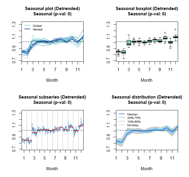
As before, the trend component was removed and then the plots were generated again. Variations of these plots are shown in Figure 4. p-val: 0 on these plots indicates that the seasonal component was statistically significant in this series.

Retail trade series in constant prices
We can make similar comments as we made with these plots for series in current prices. Variation in seasonal component decreases in the later years and March was a month with highest volatility. The seasonal boxplots and seasonal distribution plots show a very little variation in the retail trade indices from May to September. Detrended as well as the original series show that retail trade indices in constant prices in December and October being at the highest level on average, while the lowest average values were in February and January.