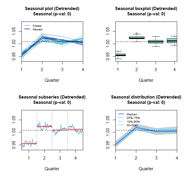
There are a few time series graphs we can use to identify underlying seasonal pattern. These are seasonal and seasonal subseries plots, with some variations in their appearance.
A seasonal plot is similar to a time plot except that the data are plotted against the individual “seasons” in which the data were observed. A seasonal plot allows the underlying seasonal pattern to be seen more clearly and to identify years in which the pattern changes.
A seasonal subseries plot is another graphical tool for detecting seasonality in a time series. This plot allows you to detect both between groups and within group patterns (e.g., do first and fourth quarter exhibit similar patterns), nature and changes of seasonality within particular season. The horizontal lines on this plot indicate the means for each quarter.
Figure 1 shows Slovenia seasonal and seasonal subseries plots for quarterly GDP time series. There is a jump in GDP in the second quarter each year. The seasonal plot also shows that in the first quarter the smallest GDP was recorded.

Levels of the curves on the seasonal plot indicate increasing trend in quarterly GDP. This trend makes a bit difficult to read and interpret nature and changes in seasonal patterns. Therefore the trend was removed and these graphs were generated again. Variations of these plots are shown in Figure 2.

p-val: 0 on these plots indicates that the seasonal component was statistically significant in this series. From the seasonal plots we can see that there are less variations in the later years than at the beginning of the observed period (dark blue lines are clustered together). From the seasonal boxplot we can identify quarters with highest volatility in GDP. It seems that volatility in all four quarters are approximately at the same level. Most of the seasonal subseries plots show variation around some constant level for respective quarters. In simple terms it means there is no tendency of increasing/decreasing GDP in a particular quarter in the observed period. Seasonal distribution plot is an alternative plot to seasonal boxplot. It also shows level of variation in seasonal component by quarter.


